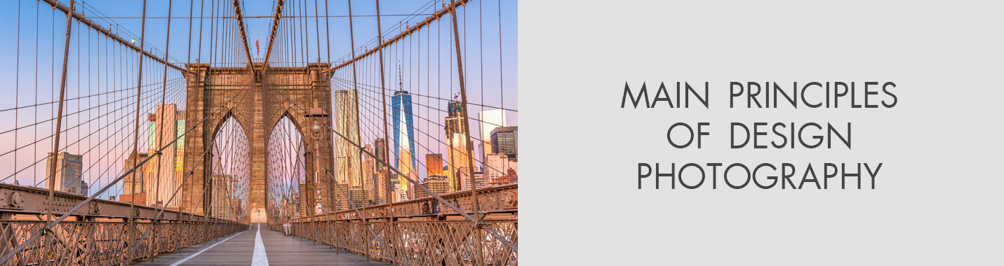
7 Main Principles of Design Photography
When you purchase through affiliate links on our site, we may earn a commission. Here’s how it works.
What Are the 7 Principles of Art and Design?
There has been much change in the mediums and trends even in the last decades. But all artists rely on these principles to express their vision or emotion date much further away, to the times of the genius Leonardo da Vinci. Learning to pay more attention to them, you will see the improvement of your art.
1. Balance
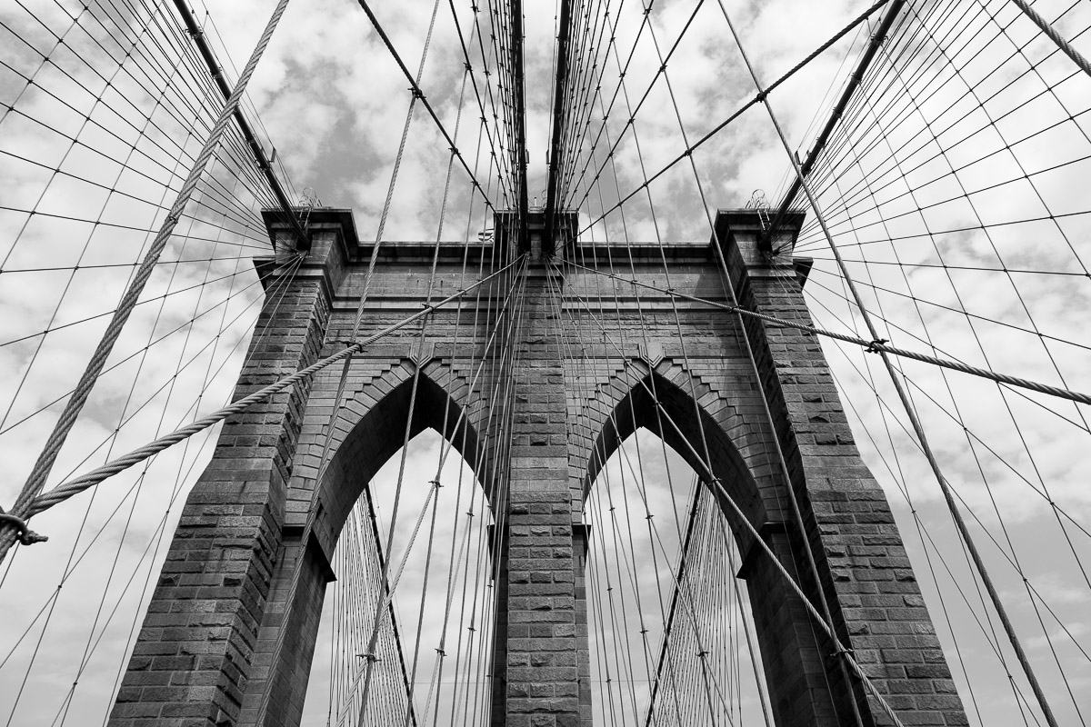 Photo by Tim Jackson
You shouldn’t be concentrating all the components of your image in one place. Here, the main point is to remind you of the importance of equal distribution and compensation. Ignore that, and the result will appear destabilized, awkward. Our brains enjoy balanced images more. In art, there are three ways to ensure balance:
Symmetrically: if the composition is divided into halves, one will precisely mirror the other. This is one of those principles of design photography that is considered classical and stable, sending us back to the Greek temples.
Asymmetrically: the components of each half of the composition differ but together they counterbalance each other. You can play a lot with this principle, engaging colors, textures, forms and placement.
If there are two objects of different sizes involved, the smaller one can be made “heavier” with a darker color or a thicker texture. Such a way of stabilizing designs feels more modern.
Radially: the composition has the central element and then others radiating away from it evenly. Such an image would produce a dynamic effect and feel as if set in motion.
How To Apply Balance To Your Portfolio?

This step needs your undivided attention because harmony in photography exists on many levels. Carefully consider the need to insert a component that destabilizes the entire project.
Placing the different elements of your portfolio, make sure to respect total symmetry. Or, if that’s hard to do, counterbalance the main components in a different way that will pull the page together. That requires you to cautiously place such items as footers, galleries or scrolling strips.
Once the layout of the page is done, remember not to break it by uploading new images. If there are four photos in each row, the last row with two photos only will ruin the balance.
- View more product photography tips.
2. Emphasis (or Dominance)
 Photo by Rick
How can you unite such different pieces as The Third of May, 1808 in Madrid, and the powerful episode of a stroller tumbling down the Potemkin stairs? They are all dominant. Such an episode is the author’s will to put a stress, like Goya’s poor worker who’s wearing white or Eisenstein’s stroller in the movie.
Commonly, the emphasis would be put using contrasts, but there are other ways.
Following the seven principles of art and design, you should always single out the crucial component – the focal point. Its presence in the work assists the viewer by first showing the important and then helping him see the rest.
As Alex W. White stated in his work on the subject, when the author avoids putting an accent, all the components seem equally powerful and force the viewer to search for the true meaning among various possibilities, which might be too much of a task for some.
How To Apply Emphasis To Your Portfolio?

Naturally, you would think that every aspect of your website important. But there are certain aspects that matter more than the rest. Consider what you want your viewer to see in the first instant.
But even before you start designing the website, think of the leading call to action (or CTA) for your business. For example, a wedding photographer would aspire to get more bookings, so the booking button should be the primary element.
A travel photographer, instead, would care more for subscriptions, so the urge to follow the latest adventures should go ahead of everything. Make your CTA dominate the page by using such means:
The font: should be increased for the important items.
The color: makes things pop out more if it’s bright, especially when surrounded by muted shades.
The emptiness: as one of the 7 design principles suggests, contrast is highly efficient in directing attention where you want it.
3. Pattern (or Repetition)
 Photo by Andre Ermolaev
Repetition helps viewers understand the surrounding world with its regularity, be that in manufactured objects, organic materials or abstract forms.
Arrange the design through a predictable repetition that already becomes your pattern. A simple pattern repeats a few components but helps the entire concept work in unison.
Don’t be mistaken to think repetition a synonym of boredom. Our brains are easily satisfied with simple patterns. Indians know it, using their mandalas, which in their essence are a neatly organized multitude of colorful points, to achieve Nirvana by simply taking a look at them.
Among other principles of art pattern is the one that helps you in matters of unifying a composition or identifying as a brand because of its consistency.
- Check out the best photography books for inspiration.
How To Apply Pattern To Your Portfolio?

We all know what rhythm is in audio but visually it can be reconstructed with duplicating elements. Select special fonts and colors for that, alternating between 2-3 repeating options in each following element.
This way you will create a pattern that’s memorable so potential customers would think of your website next time they want a photography service. If you are good at design, personalize existing icons, buttons and other forms that are in public access online, making your design pattern truly unique.
A great assistant in that is the Artlandia Glossary of Pattern Design, an online encyclopedia of patterns, that collected everything that’s imaginable and is a perfect tool for inspiration.
However, this is one of the most difficult principles of design photography to follow safely since the border between artistic repetition and plain monotony is way too easy to cross.
Avoid overloading your page, add some blank spaces around elements or otherwise break the space a little.
4. Unity (and Harmony)
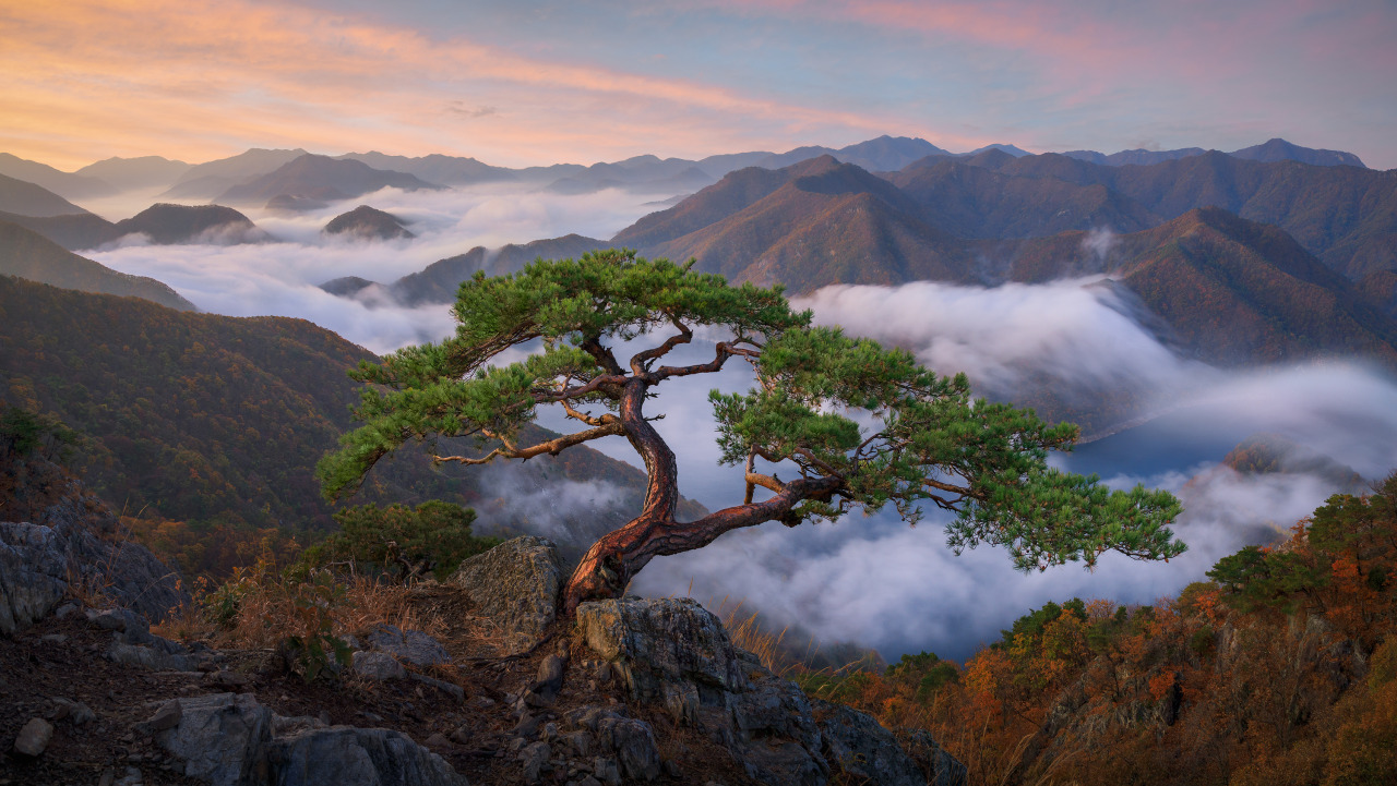 Photo by Nathaniel Merz
When all components of the design feel like they are singing along one tune, this is called unity. A coherent picture can be constructed by including similar colors or their tones, concepts, elements.
In such mistakes as bad cropping, weird angles, wrong exposure setting, you can witness the disunity. It disrupts the harmony of the shot.
For making sure all the components of the shot sing along, you need to consider the photographic goal beforehand. Picture the most exquisite result you would like to achieve and then use the photography principles and aim the camera.
When you plan ahead, there is enough time for you to understand your own concept better and get the most out of the shooting conditions, which brings better results.
How To Apply Unity To Your Portfolio?

As a self-employed photographer, you’re basically a business owner. Each business needs its identity to help the customers recognize it. In your case, unity is crucial. Your works need to contain an element that will be traceable across the images and serve as a sort of trademark, communicating your name to clients.
That should be visible not only in your social media accounts and website but also in the offline world, like on your business cards. Prepare to carefully work out a collection of elements that will be used throughout – in the logos, colors, fonts.
Putting together your website, you will need to achieve harmony. letting yourself space for some variety. How can you break the monotony in a harmonious way? By standardizing the elements of design photography in the skeleton of your website.
Take headers and footers and envelope them in identical fonts, colors. When that whole structure is unified, specific pages can be personalized by changing the main features and adding some new ones, like buttons, texts or images.
5. Contrast
 Photo by Venus Poon
Contrast is one of the most crucial principles of design photography. You can see the contrast when two elements of the shot oppose each other, for instance, dark vs light, cool vs warm.
However, contrast refers not only to colors and shades. With the help of the texture, you can demonstrate contrast as well. When you combine several textures in the shot, you make it more atmospheric and add a tactile sense.
One of the brightest examples of a clearly contrasting theme is a round water droplet on the plant’s fuzzy surface.
With the contrasting theme, you give a picture more meaning. To get contrast, you may also experiment with combining sharp and soft objects or surfaces, vintage and new or correctly and irregularly shaped ones.
- Find more information about the rule of thirds in photography.
How to Apply Contrast to Your Portfolio?

Keep mind that if you overdo with contrast, it will mess up the unity in photography and ruin the shot’s visual appeal. Work with contrast in a proper way and you will be able to control the viewer’s attention.
It means that contrast should be applied to the most significant elements of the scene. Talking about photography websites, the focus is supposed to be on the person’s or brand’s name so that the clients know how to address a photographer, the work a photographer does (photos) and a contact form for the clients to know how to order these services.
The best way to make the most out of photography principles for a portfolio is to change the background color. I am sure that experienced photographers know that black and white represent the strongest contrast. Use one of these colors for the background while other colors will add vibrant interplay to the shots.
6. Movement
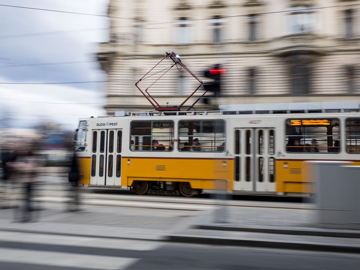 Photo by Denis Sokol
Movement is one of the seven principles of design photography. In the photography sphere, it refers to the dependence between the subject and the camera’s shutter speed. For design and art, movement characterizes the path of the viewers’ eye when he/she observes and tries to understand a shot.
For instance, lines in photography visually create “roads”, which viewers follow with their eyes.
Uneven lines cause confusion, make viewers shift the gaze from one point to another. Curved lines are more on a delicate side, making the viewers’ eyes slow down when viewing the shot.
If you want to learn the principles of design movement and know how to control it in photography, start with exploring the psychology and nature of human sight. For instance, people’s eyes react differently to different colors.
Red is an eye-catching color. Soft blue shades are tender and delicate. So you can guide movement by using saturation and color selectively.
There exist plenty of ways to direct the viewers’ eyes across the shot. Movement deals with the nature of the human eye and how people perceive visual info from the psychological point of view.
How to Apply Movement to Your Portfolio?

Many website creators provide advanced features that let users add movement to their sites. According to the principle, the page is divided into several sections, which are moving at a different speed.
As a matter of fact, the speed distortion produces the 3D illusion that you may see in this stunning photography template.
But the movement in photography websites doesn’t necessarily involve the modification of elements. Motionless items can help you achieve movement as well. Look at the template once again, especially at the golden lines between the sections.
Since they are directed vertically, they make viewers scroll down and learn more. In fact, a series of dots, arrows and lines do a great job of guiding the viewers’ eyes. Don’t forget about numbers. Similar to chapters in the book, they naturally add dynamics to the photography website.
- Check out WordPress photography themes for your site.
7. Hierarchy
 Photo by Juan Carlos Fonseca
The majority of art pieces are characterized by certain features. However, not each of them plays an important role. A decent composition is supposed to have three levels of importance: the most significant, the least significant and the rest in the middle is equally significant.
Talking about hierarchy as a part of the principles of design photography, it implies proper visual arrangement of the content. It is necessary for the viewers to come across the most significant information first.
How to Apply Hierarchy to Your Portfolio?

Find a pen, a sheet of paper and draw an outline of the future page.
Answer the following questions: Which piece of information is the most important one? The least significant? What portion may be placed in the middle?
Organize all the information, arranging it visually on the page and locate the key content in the noticeable sections.
According to the principles of composition in photography websites, the center is the first thing that catches the viewers’ attention. However, the research conducted with the help of eye-tracking technologies showed that people look through the websites in an organized manner.
Human eyes follow a “Z” or “F” pattern, moving from top left to right and down.
Also, people tend not to pay close attention to the content in the middle of the page but rather scan it shortly. So you need to locate the most important information in the top left corner of the page and the least significant – in the center. If you organize the page this way, you will create an optimal composition.
Elements of Design Photography
Professional shots feature a certain order. Lines, shapes, forms, textures, patterns and colors are elements of composition in photography that add and highlight this order.
They greatly influence the picture, primarily textures, colors and lines. As a matter of fact, people perceive and use these elements without even realizing this regularity.
Line
 Photo by Warren Agee
With the help of lines, you can shift the main emphasis in photography and the viewer’s gaze towards the point of interest, change the mood and the atmosphere of the entire shot.
Lines can be horizontal, vertical, curved and diagonal. They can also be long and short, thin and thick. Lines may guide you away or point to something in a picture. Lines deeply influence the emotions people feel when viewing the shot. The lines may be dynamic, calming, scary, peaceful, assertive or directive.
Some people perceive thin lines in photography pictures as weak or unsteady. Thick lines may seem strong and assertive or harsh and strict. Curved lines are seen as calming, peaceful, soft and smooth. Jagged lines are associated with chaos, force, sharpness and threat.
Shape
 Photo by Sonya Etchison
According to the composition principles of design photography, the next element is a shape. The main rule here is that the shape should be recognizable. You need to shoot the subject with the backlight or front light to make the shape defined.
To recognize the shape, I recommend creating an intense contrast between it, other items and the background. In this case, you literally detach the shape from everything that surrounds it.
Form
 Photo by Daniel Kordan
Design photography principles state that form is pretty much a three-dimensional shape. The form needs to be illuminated by side lighting as it produces soft beautiful shadows.
This contrast between shadows and light greatly demonstrates the depth of the subject, gives the general idea of the shot and adds more context to it.
Texture
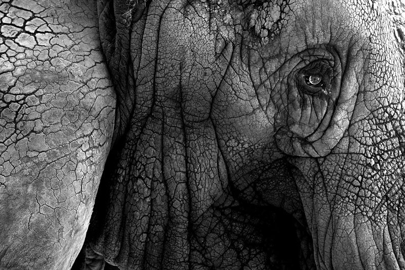 Photo by Karen Pulfer Focht
Another element that has an emotional effect on the viewers is a texture. The main difficulty of perceiving and shooting texture is connected with light.
That’s why I suggest illuminating the texture with the sidelight early in the morning or early in the evening. Another way is to use the light from above when the sun is vertical and high in the sky.
The high sun in the sky emphasizes the rough texture of the walls of a building, the wood texture of tree trunks or any type of texture along the vertical surface. It happens because the light from above throws shadows along this surface.
The influence is quite natural but it makes the shot deeper, more appealing, adds realism and contributes to the harmony in photography.
Pattern
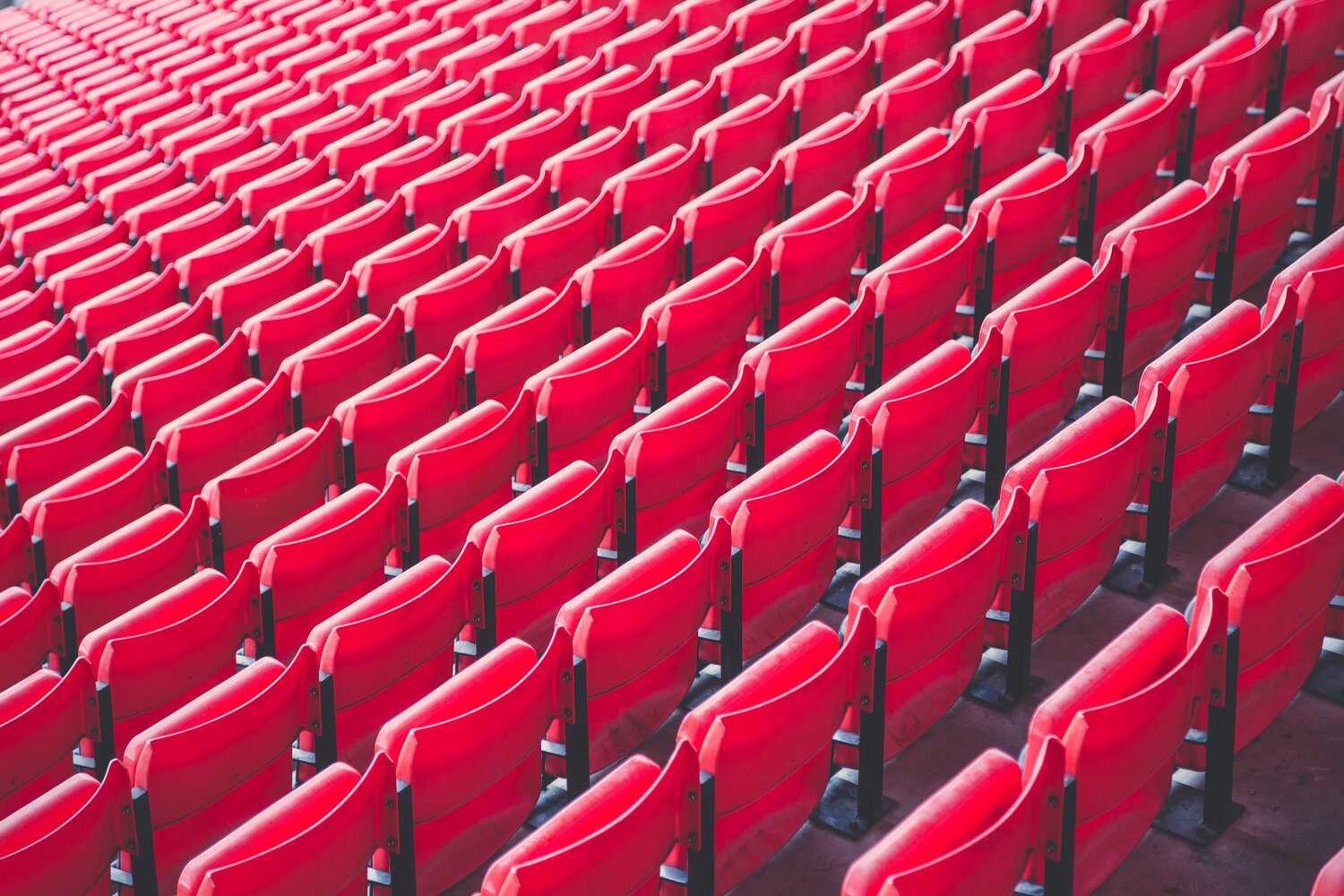 Photo by art911
People are surrounded by patterns. They are integral parts of our everyday life. Patterns make human lives less chaotic. We are so used to seeing patterns everywhere that sometimes don’t even recognize them.
The principles of art pattern in photography distinguish two approaches: either break or make an emphasis on a pattern.
Breaking involves picking an object that will destroy the pattern’s endless flowing. This may be an object which clearly contrasts with other subjects in color, shape or texture.
You should know that a broken pattern requires a careful arrangement of the composition. In this case, the rule of thirds will greatly help you out.
Making an emphasis on the pattern will underline the frame’s expansion and size. It involves zooming in onto the pattern and filling the shot with it. An emphasized pattern involves people’s faces in the crowds, lines of identical plants, wall bricks, etc.
Color
 Photo by Simon Wrigglesworth
The primary characteristics of color are saturation, hue and value. Colors, their arrangement make a big difference in all types of photography. Each color has its own mood, associated with a certain emotion and influences the visual appeal of the shots.
Vivid colors are eye-catching, dynamic and full of energy, the same as yellow and red. Green and blue colors bring comfort and have a calming effect. The proper color balance in photography you can achieve depends on how deeply you feel and understand different colors, especially those that surround you.
Also, I would like to mention that there exist two types of colors: additive and subtractive. In turn, each type is divided into primary and secondary colors. Photography, printing and painting deal with subtractive colors – that’s what I was talking about in the article.