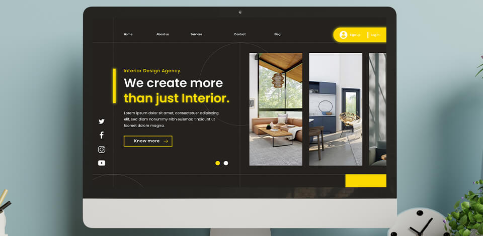
If you are a photographer who is eager to develop your own brand, boost your conversions or attract new customers, this guide that explains how to use landing pages to grow your photography will come in handy.
This method is a part of the general photography marketing strategy that brings really impressive results, as a well-built landing page induces your client to instantly perform the action you want.
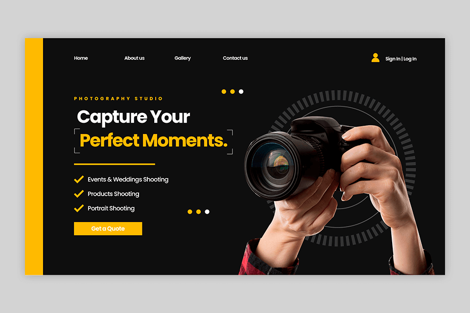
A landing page is a single-page website, the purpose of which is to encourage a visitor to take a specific action. When it comes to photo business, this can be participation in a photo day, ordering a photo session, subscribing to a photography blog, etc.
After clicking on a post, users will be redirected to this web page. They will also land on such sites after clicking on an ad, a search result in Google, or another digital location. In other words, this is the first destination a person gets after visiting your website.
Landing pages can help photographers solve various tasks.
Increasing Conversion. No matter whether you want to get more inquiries, expand the list of your contacts, or achieve another goal, a photographer landing page would be an excellent solution in any of these cases. This is your effective tool for getting top-level results.
It does not contain any distractive elements or unneeded links. The content published on a landing page is customized according to the user’s needs and preferences and has a single aim to encourage a visitor to perform a specific action.
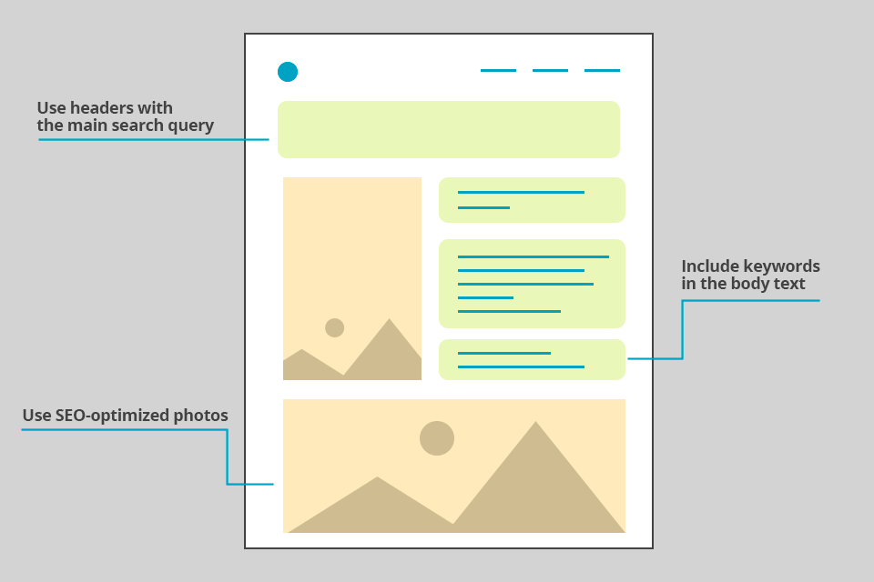
Improving Search Engine Optimization. Effective SEO and online visibility are very dependent on landing pages, as they take people to pages on your website related to particular keywords or topics.
For instance, if you are a photographer who works in Chicago, your potential customers will be also from there. So your aim will be to reach out to the people who live in this city or even in a specific district.
This allows your business to rank for a narrow list of keywords related to your product and industry. Remember that by selecting specific keywords, it is possible to target the prospects that are likely to become your loyal customers.
Optimization of the Marketing Costs. Promoting your business using landing pages is one of the most cost-effective methods. Instead of ordering high-priced services from a digital marketing agency, hiring a personal assistant, purchasing ads from bloggers, you can take advantage of free website builders for photographers, which are beginner-friendly. Getting maximum value through a landing page that directs customers to your most important links is especially valuable for photographers and restaurant landing pages. It ensures that potential customers easily access reservations, and contact information, streamlining their experience and boosting your online presence.
Generation of a photography landing page that meets the specific needs and interests of your audience results in higher conversion without much investment. It means that you get more customers spending the same amount of money.
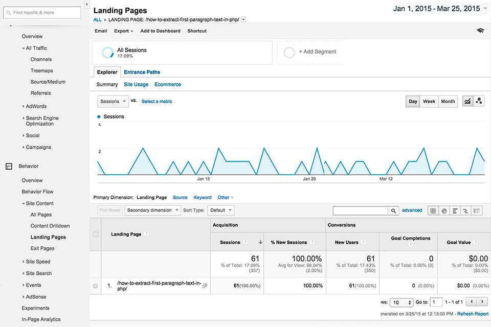
Easy Performance Tracking. With a landing page, tracking various types of metrics like click-through rates, bounce rates, and conversion rates is a no-brainer. This provides valuable insights into the results of your marketing campaigns, allowing you to make decisions backed up with verifiable data for forthcoming campaigns.
Ability to Demonstrate Your Achievements. Landing pages usually contain customer testimonials, industry awards, or showcase accomplishments – all these undoubtedly induce visitors to take the needed action.
A photographer landing page is where you can present your best works and boast your original style. By doing so, standing out from competitive businesses, which is crucial for winning new clients, is a piece of cake.
On a landing page, post only a specific selection of your work, for example, in a certain genre, so a client won't get lost, as happens when viewing a full portfolio on the website.
Landing pages have a certain structure and design rules, thanks to which they can effectively perform the required tasks. Before you start writing the text and creating the design, it is important to determine the page vector.

Readymag
Need a solution to make this process easier and more effective? Readymag is the place to create amazing websites with no need for coding. Engage your potential clients with interactive multi-step animations, custom cursors, galleries, etc.
Think about your end users and the needs that they will satisfy with the help of your services. Another important task is to define what makes you stand out from other photographers and determine the peculiar features that prompt users to address your business. Only then proceed to the creation of the landing page.
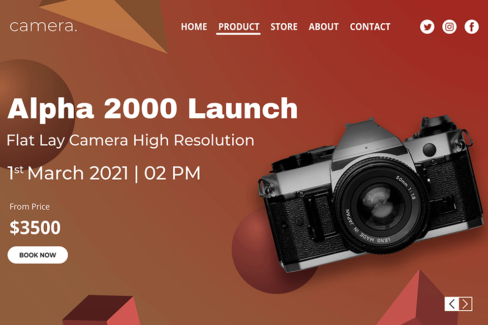
Even if you offer a quality product or service, but don't know how to sell it, you will remain unnoticed. Describe your service in such a way that it arouses interest and desire to receive it in an instant.
Intrigue visitors with a strong question or statement that touches on the subject important for your potential clients. Create heading and bullet points to show your prospects the advantages they’ll get by turning to your business.
However, do not overburden readers with too much info, as you can confuse them and delay the decision-making process. If you face difficulties, trying to formulate the offer enticingly, you may use the KuaAI tool to generate digital marketing-friendly & channel-specific descriptions.
Useful tips:
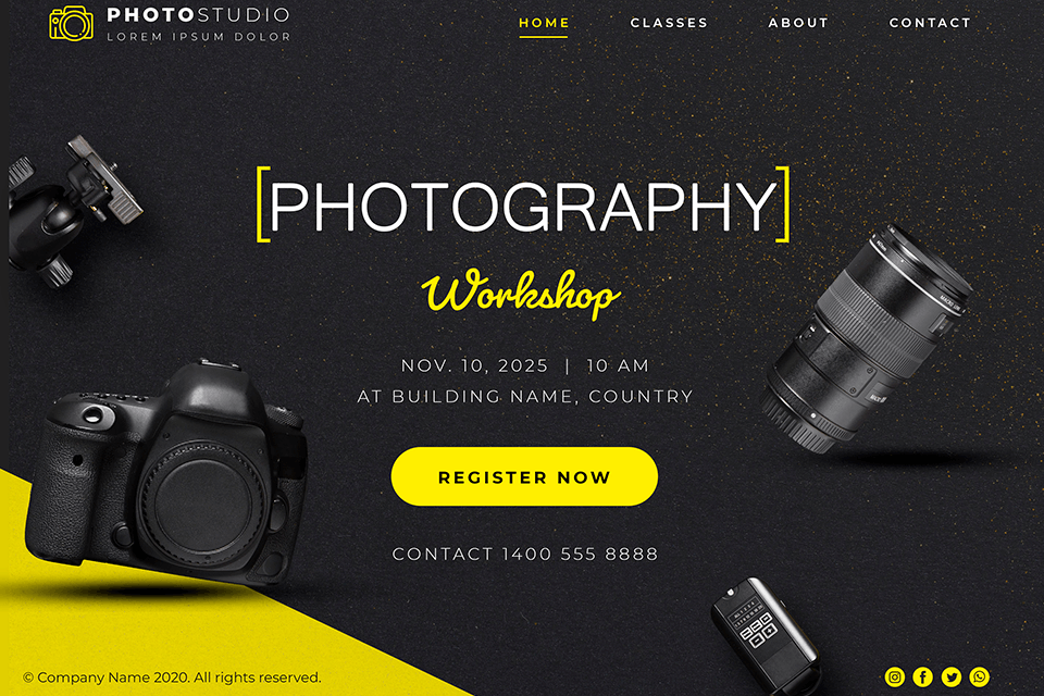
Determine the main action the person who got to your landing page should perform and design it as a button. The CTA must be clear and as capacious as possible, do not make it too short (such as "Order"), but also not too long ("Order spring wedding photography").
The best option would be to "Order a shoot", as the person will understand what kind of shooting it is from the context.
One call-to-action is enough but make sure to repeat it several times throughout your photographer landing page providing a visitor with the convenience of having the required button right at hand whenever he/she decides to take the targeted action.
To come up with new ideas and get motivated, check the photography marketing templates or the examples of landing pages on Behance or Pinterest.
Useful tips:
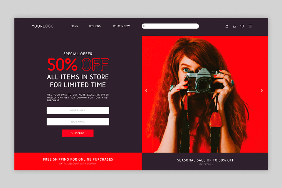
By adding forms to your website, you can gather all the required info about your client and provide top-level service in an instant. A popular online form builder will help you with this issue.
Think of what kind of data you need to get from a client. Make sure the form is not too big, so the number of fields should be restricted. You can understand what forms work best by checking out JoomShaper. Invite a visitor to provide his/her full name, indicate contact number or email, as well as fill up additional fields telling about the desired date and time of a photoshoot, etc.
Useful tips:
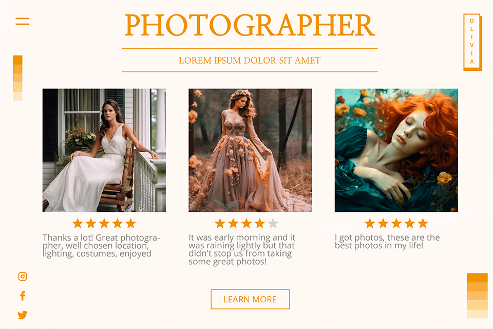
People are social beings, so positive feedback from your customers is a crucial part of the landing page. Add a small block with reviews, which contain positive comments from the customers who have been satisfied with your service - this will add more trust to your brand.
If you have any rewards, it would be appropriate to include them in this section. In addition, you can mention the popular brands you’ve collaborated with.
Useful tips:
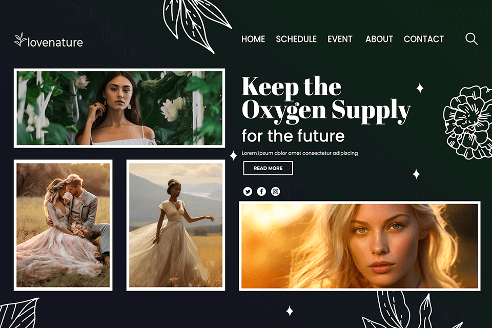
Photo, video, gifts, and other types of interactive content will make a photographer landing page more productive. Include images that convey your message and offer as accurately as possible. Get them ready for being published.
Do not overload the landing page with photos that do not relate to the subject, and also make sure that they harmoniously blend into the overall style of your page. If you offer services or products that are rather practical than creative, e.g., home inspection assistance, carpentry service, house cleaning, and the like, it is still a good idea to use visual elements on the page but you need to stick to a reasonable number. Check out Inspection Support Network to grasp the idea better.
Useful tips:
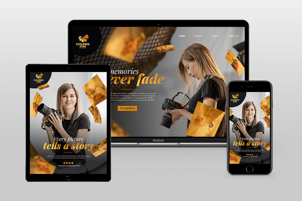
As nowadays most users consume content via mobile devices, make sure that your landing page is mobile-responsive. As a rule, pages generated with the help of popular web design software, are displayed correctly on mobile screens.
Do not avoid testing a page on various devices before its launch. One of the easiest ways to do it is to ask your friends to check if everything is ok. You can also customize the page content specifically for mobile users if required. You should also perform testing if you connect third-party tools, e.g., OptiMonk, to your page.
Make your page more compact by concealing sections that are not essential for decision-making.
Useful tips:
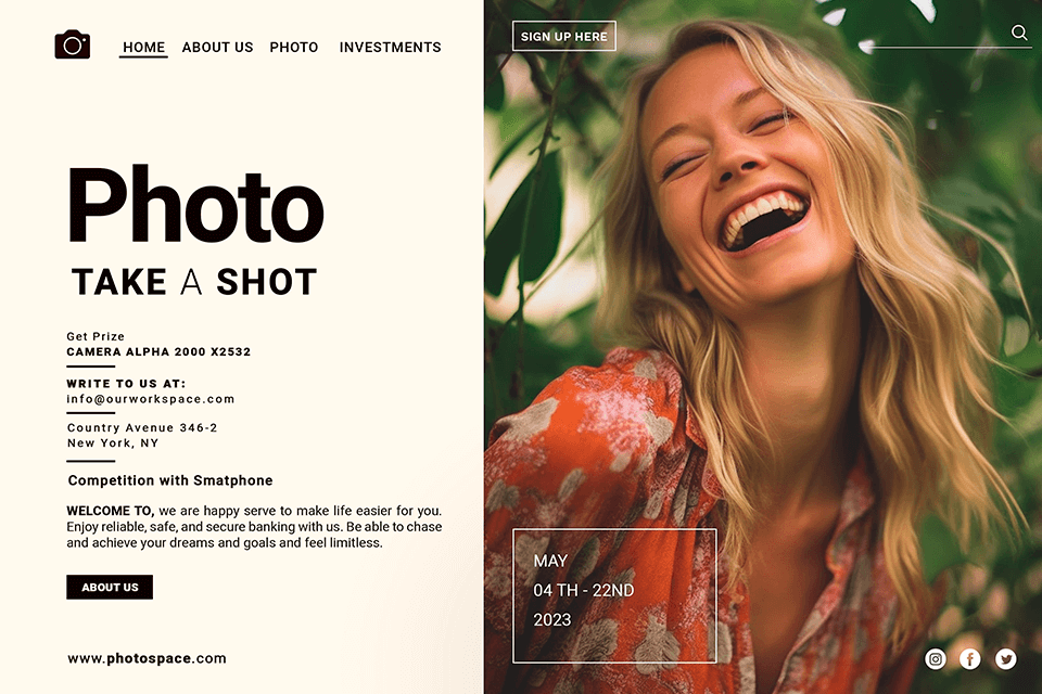
The main task of the landing page is to perform a single action, so do not add unnecessary navigation or additional buttons. Your aim is to keep the client on this page and remove all distractions.
But adding contact information, a live chat (linked to your Facebook messenger), or any other method a visitor can use to get in touch with you would be a brilliant idea, as hesitant prospects will convert more willingly in this case. If you want to have a smooth start with making landing pages for your business, you may try the Unicorn Platform tools for building websites. With them, you can create the needed site quickly. Besides, if you want a full-scope assistance with business launching and growth, you can reach out to Venturz team.